The bitcoin expanding average bands indicator
A way to assess bitcoin price tops and bottoms.

Is bitcoin expensive or cheap? Are we on a market top or at a market bottom? Let’s review an indicator that can help us assess this.
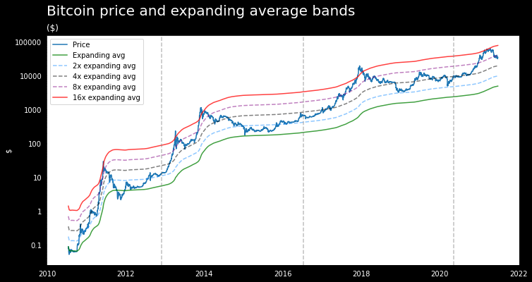
This indicator is the expanding average bands. It is simply the expanding average (historic average up until any given day) of bitcoin’s price, the green line in the chart below. The other lines are the expanding average times 2, 4, 8 and 16 respectively.
We can classify the signals this indicator gives as follow:
Market bottoms: when the price of bitcoin touches or goes below the expanding average (green line) or the 2x expanding average (light blue dashed line).
Market tops: when the price of bitcoin reaches or goes above the 16x expanding average (red line).
Intermediate tops/bottoms: at 4x and 8x expanding bands.
At $64k back in April bitcoin got really expensive as its price reached the 16x expanding average (red line) and a strong correction was due. Reaching the red line has historically been associated with the end of bull markets, except in 2013 when prices corrected to the 4x expanding average and then recovered again to top at the 16x average.
Another way to see this indicator is as the chart below, which shows the bitcoin price in terms of the expanding average. Tops and bottoms occur when the index goes above or below the dashed gray lines.
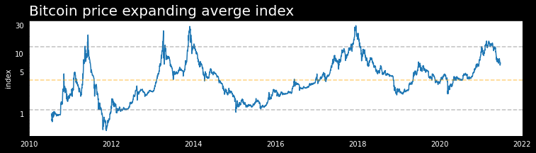
Has the bitcoin price topped yet?
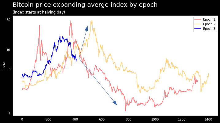
In the following charts we plot the expanding average index for each of bitcoins epochs/cycles.
The first chart shows the expanding average index starting after each halving. We can see that so far the index in the current epoch (blue line) has followed a similar upward trend than in past epochs. The important thing to know would be which path it is going to follow going forward, upwards as in epoch 2 (yellow line) or downwards as in epoch 1 (red line)
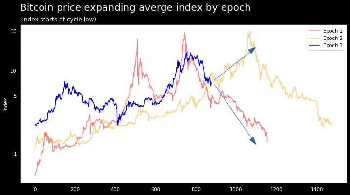
A similar analysis can be drawn in the below chart, which shows the expanding average index by epoch, but starting at each cycle’s low.
Certainly an indicator to follow for the next few months.